Glenn Robertson

Is a Product Designer
and he has...

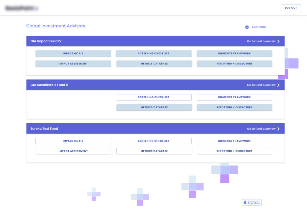
Designed a platform for funds to evaluate ESG & SDG  based Impact Metrics as a part of their due diligence.

I worked directly with our client to craft their vision for an all-in-one ESG reporting and management platform. I led the end-to-end design from conception to the final client approval of the prototype. 

As Principal Designer at Eureka Software, one of my first challenges was taking over a partially developed project that an outsourced agency designed. Despite the challenges involved, I successfully got the project designed and delivered to the client on time… 

Designed Make Ready Bundling Services  for apartments

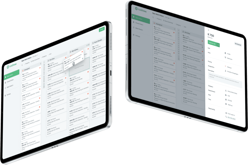
One of the most requested features at GetDone was the ability to order in bulk. Apartment managers wanted to select several units and order the same basic jobs for each. I served as senior designer on the team that created and implemented this feature in Q4 of 2021.

Launched an AI-powered call routing tool

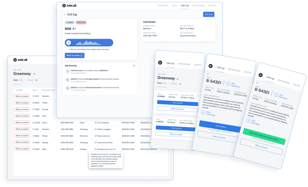
I led a cross-functional team that combined out-of-the-box services and recycled UI components to create an after-hours call-routing tool for apartment complexes. 

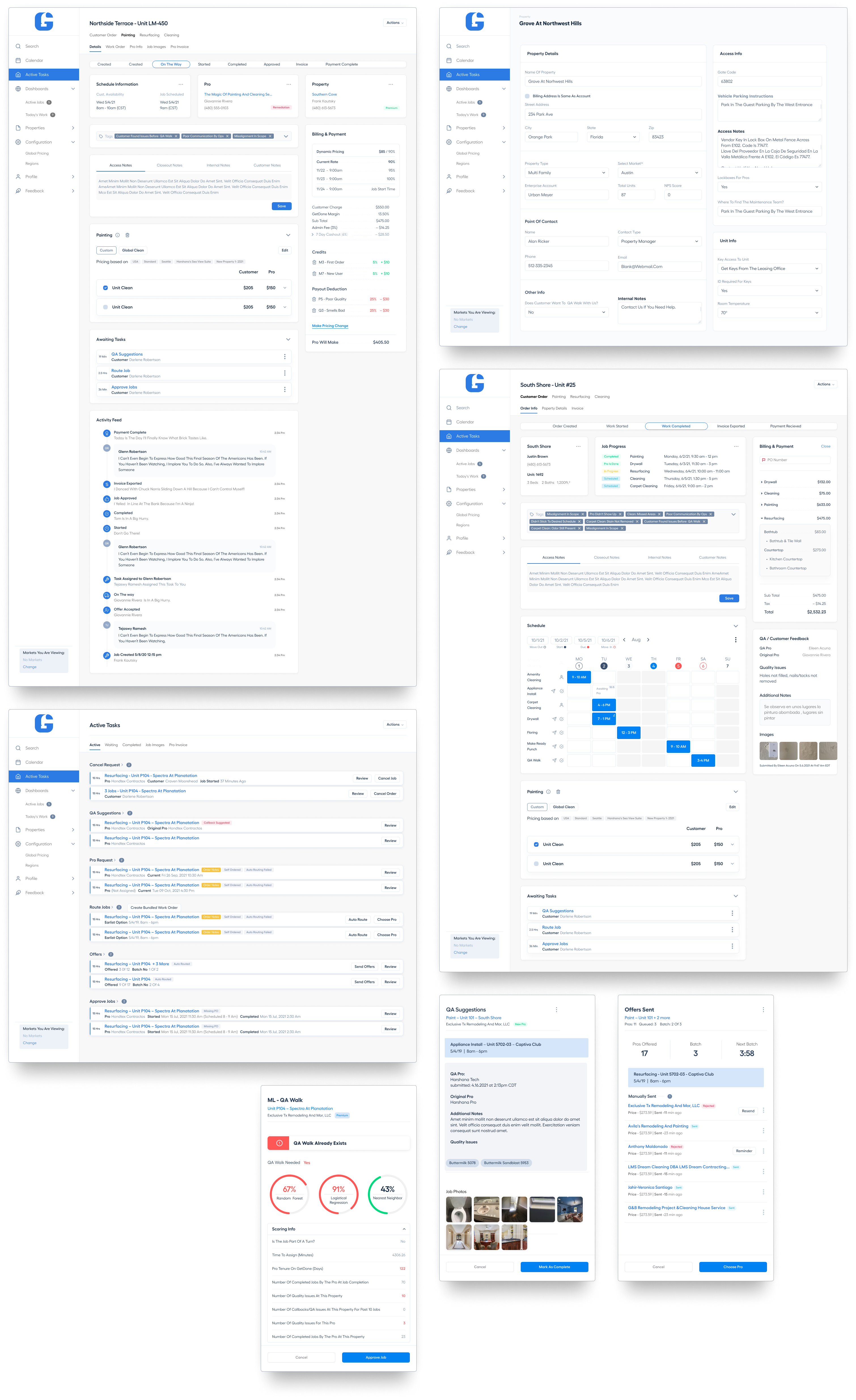
I designed dozens of updates and new features for a complex internal application that managed third-party vendors out on jobs. One feature was a task dashboard that reduced task time by 80% for application users. 

I also was the lead designer for:

  • Scheduling
  • Scope Changes
  • Make Ready Punch
  • Discounts
  • Activity Feed
  • Unit Scoping
  • And many more features… 

Created an "Uber" for apartment maintenance platform

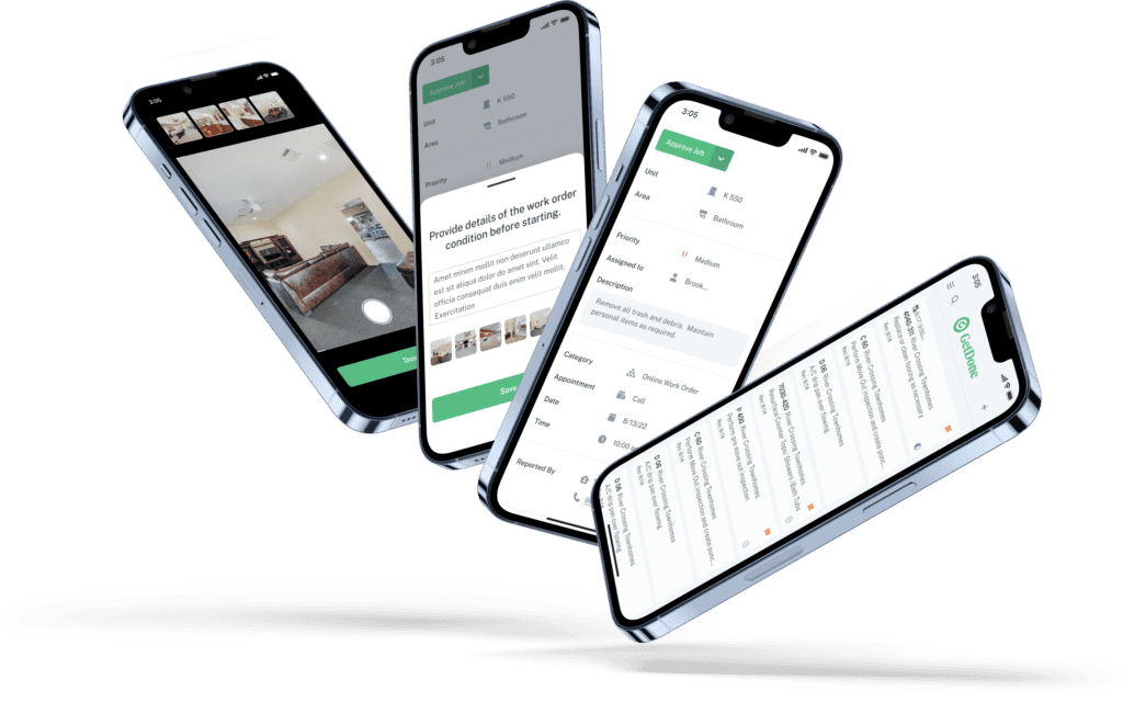
My design work on the GetDone platform enabled apartment managers to order, schedule, and Manage unit-turn jobs from third-party vendors. I conducted onsite prototype testing to ensure high user engagement when the platform was implemented for maintenance teams.

Designed a mobile Prescription management tool

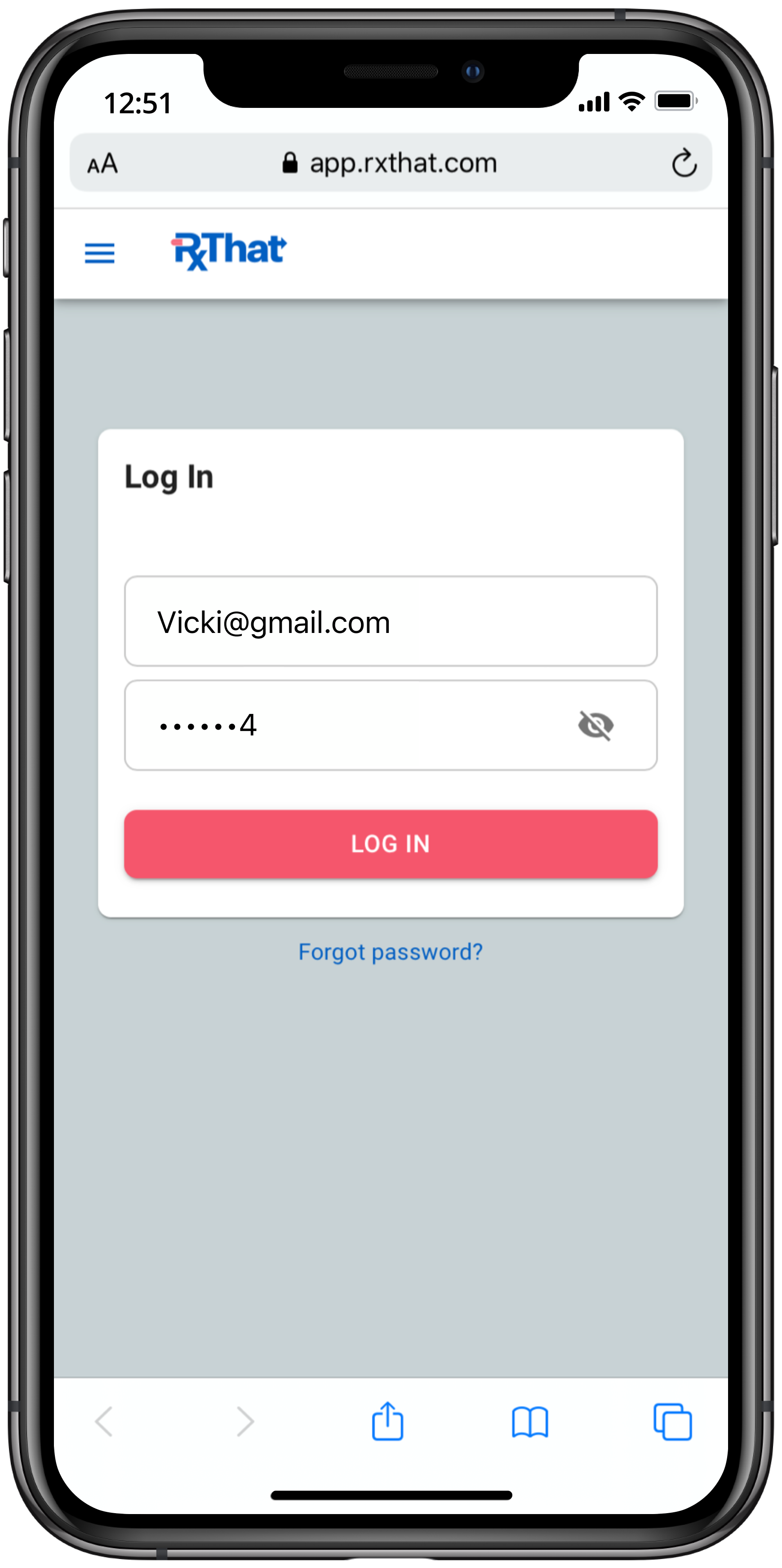
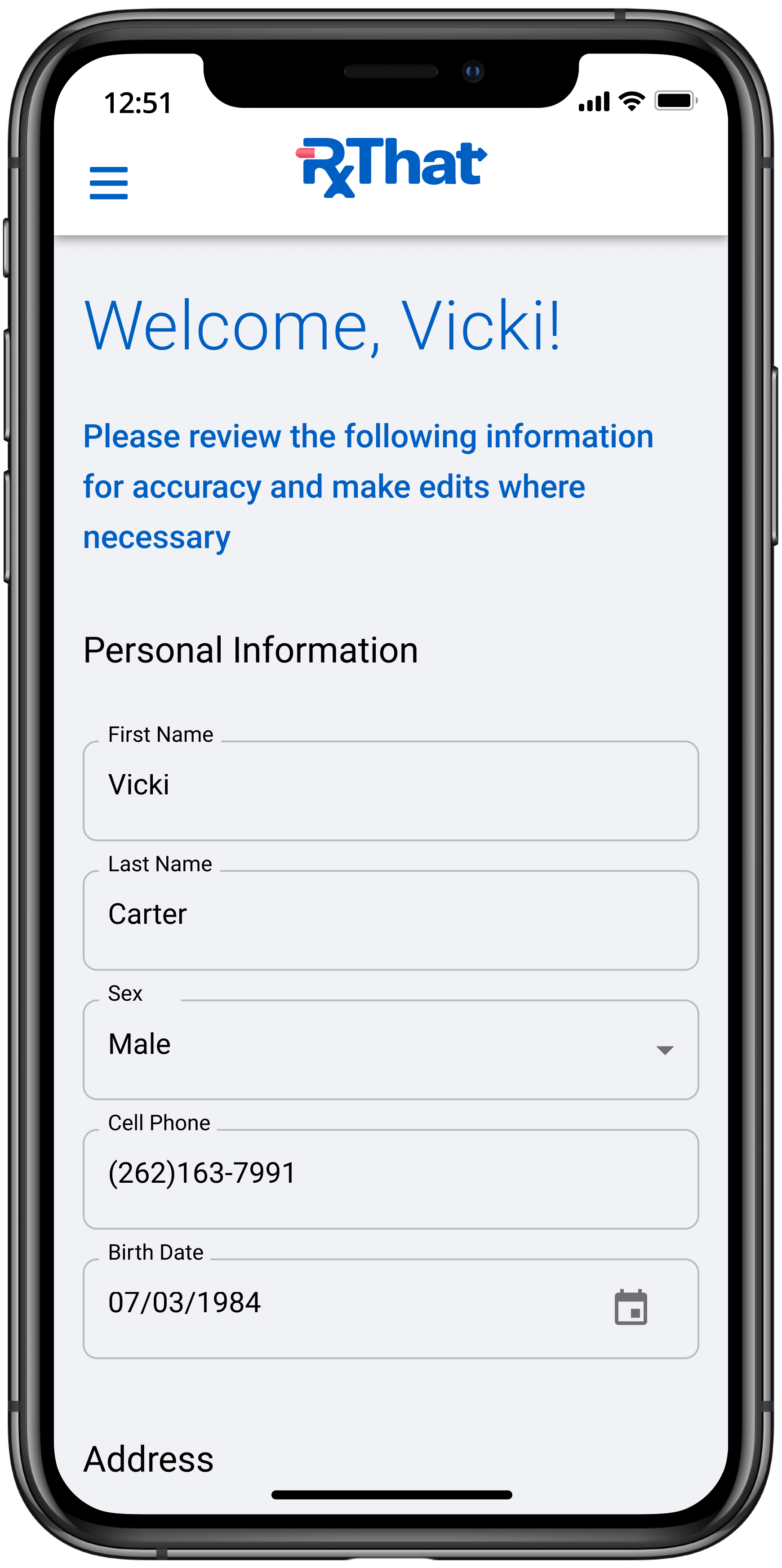
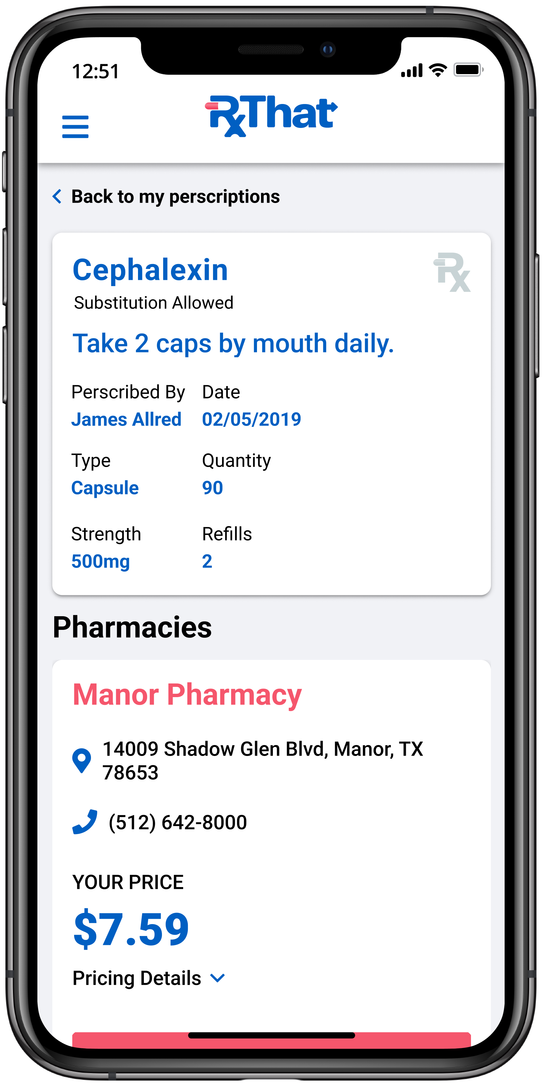
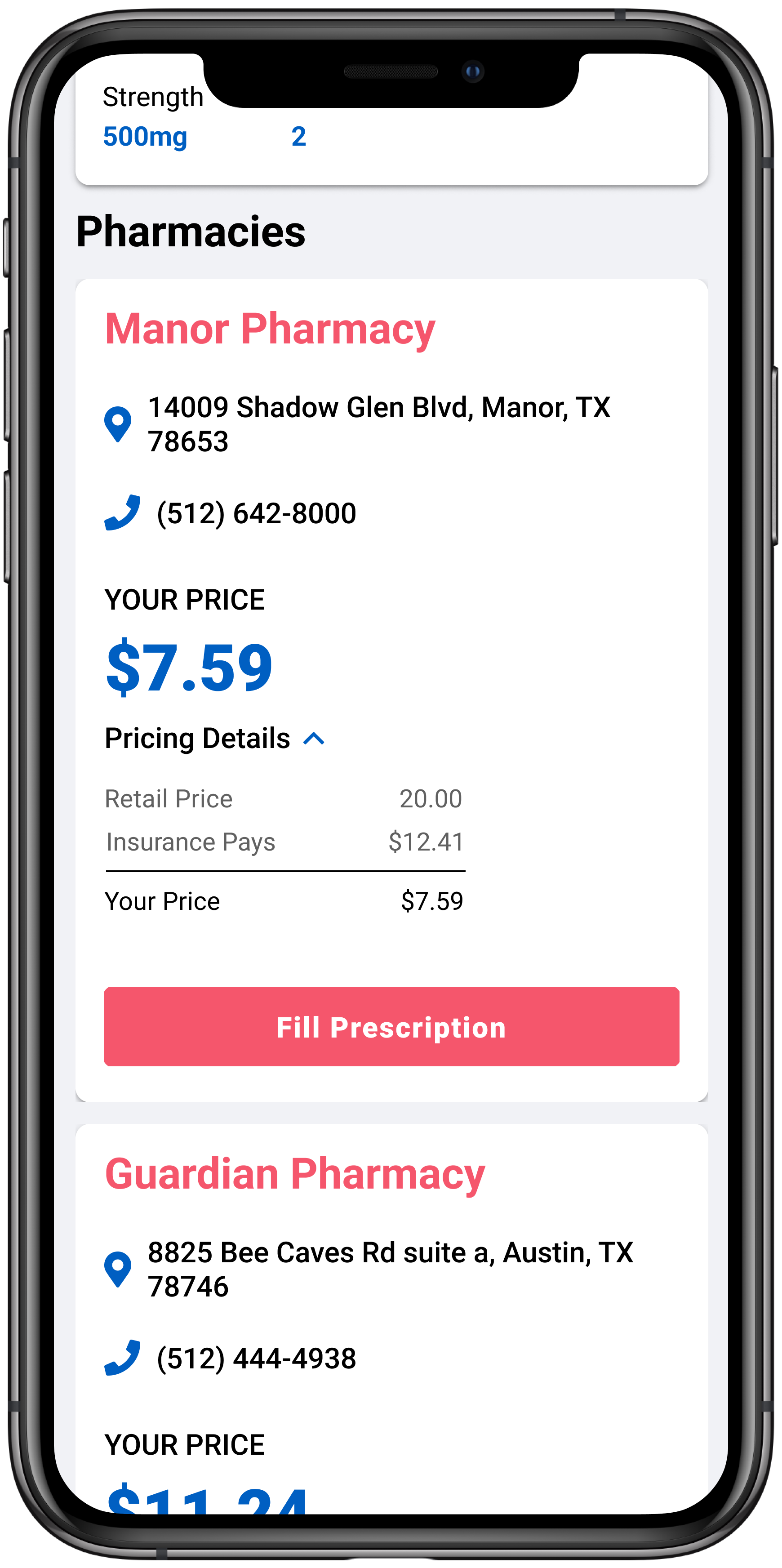
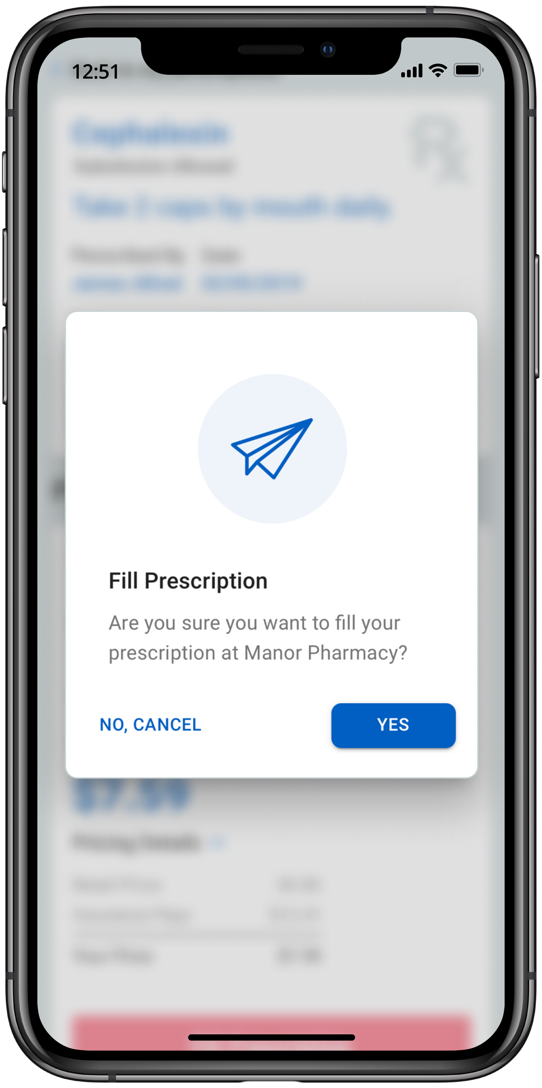
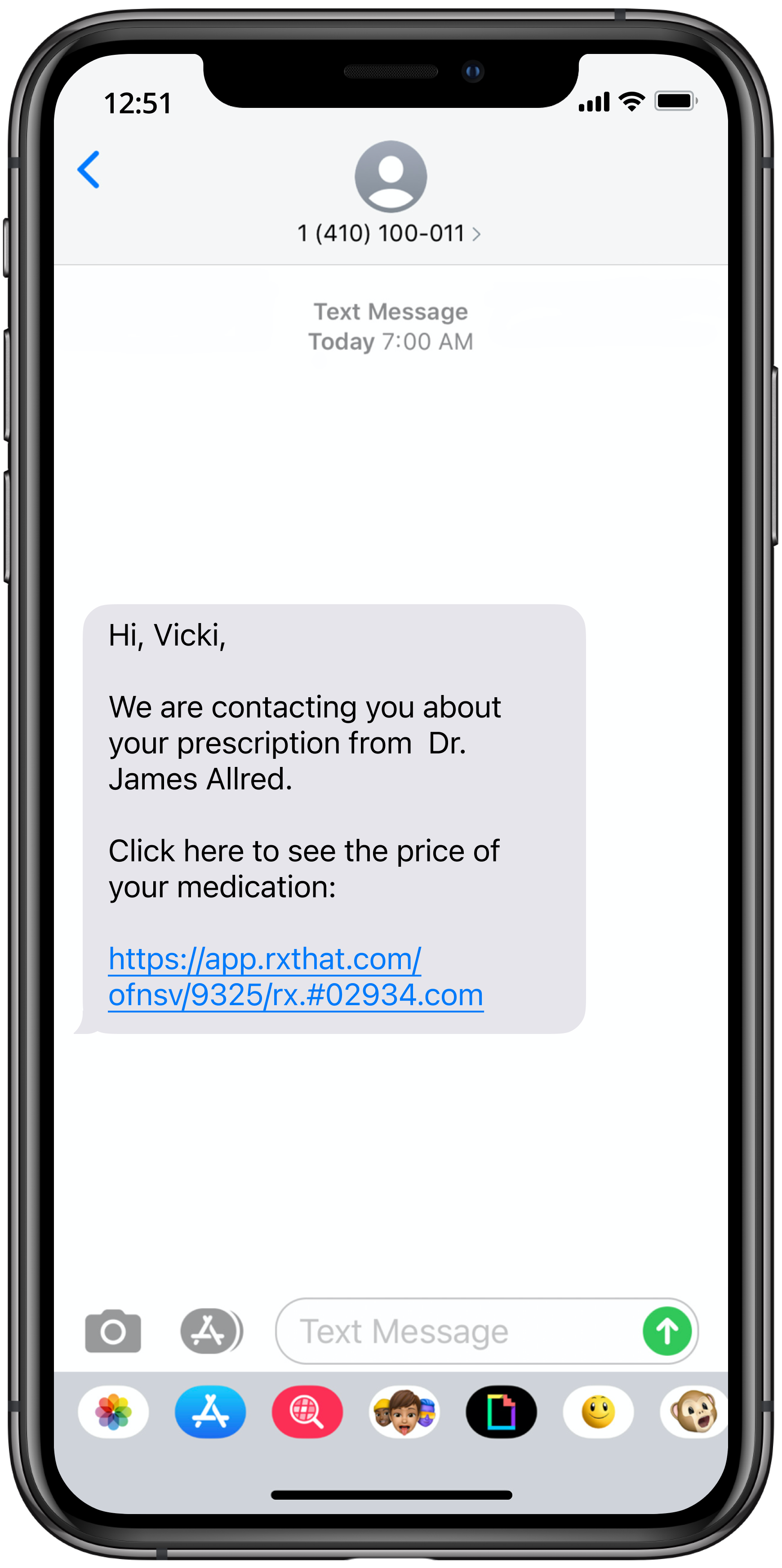
Collaborating with early-stage startup RxThat, I designed a mobile prescriptions pricing tool that empowers patients to fill medications at a fair price at their chosen pharmacy.
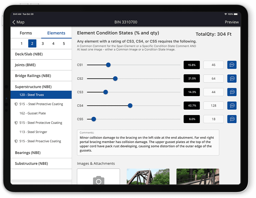
I led the design for the first mobile bridge inspection app used by the state of New York. I worked alongside a team of civil engineers to understand their unique needs when it came to a bridge inspection tool.

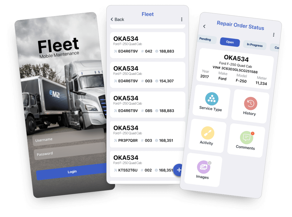
Created a Mobile Repair Order Solution for Kentucky’s DOT

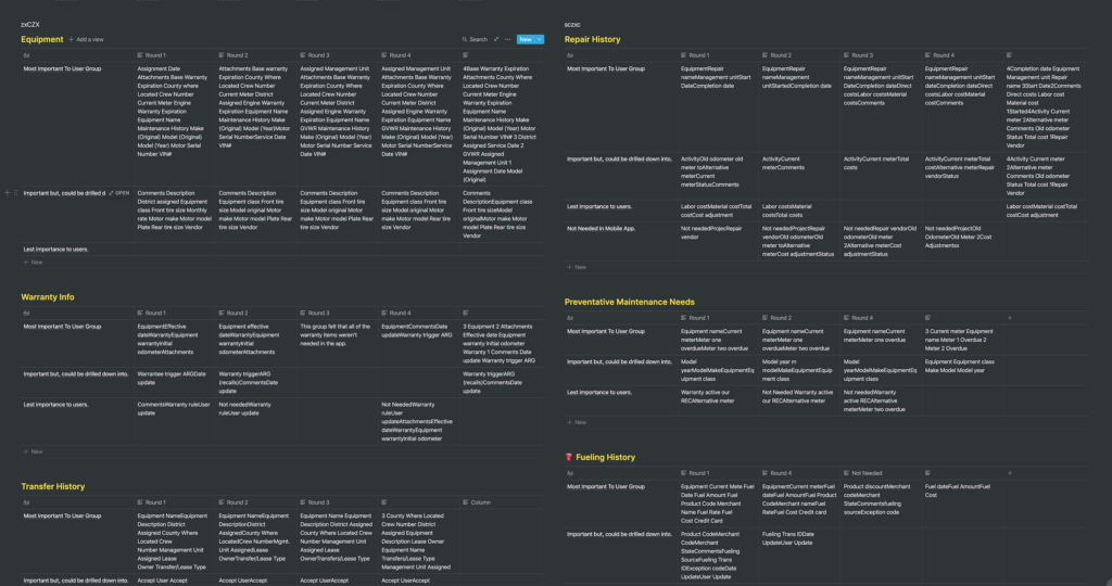
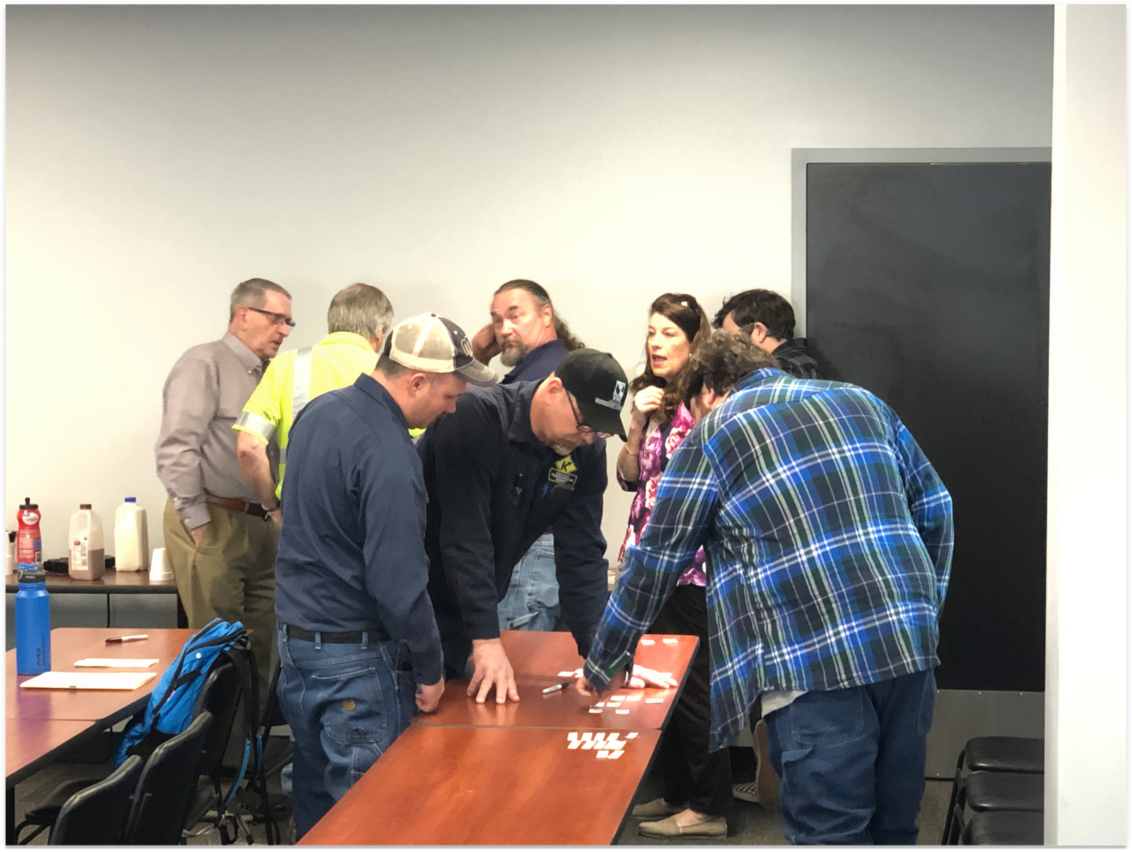
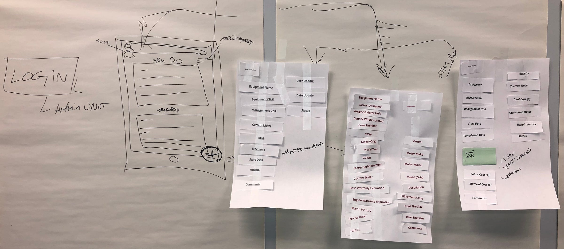
Led the end-to-end UX/UI design for a mobile repair order tool for Kentucky’s DOT. I facilitated design thinking workshops for government officials that led to buy-in from key stakeholders and officials. 

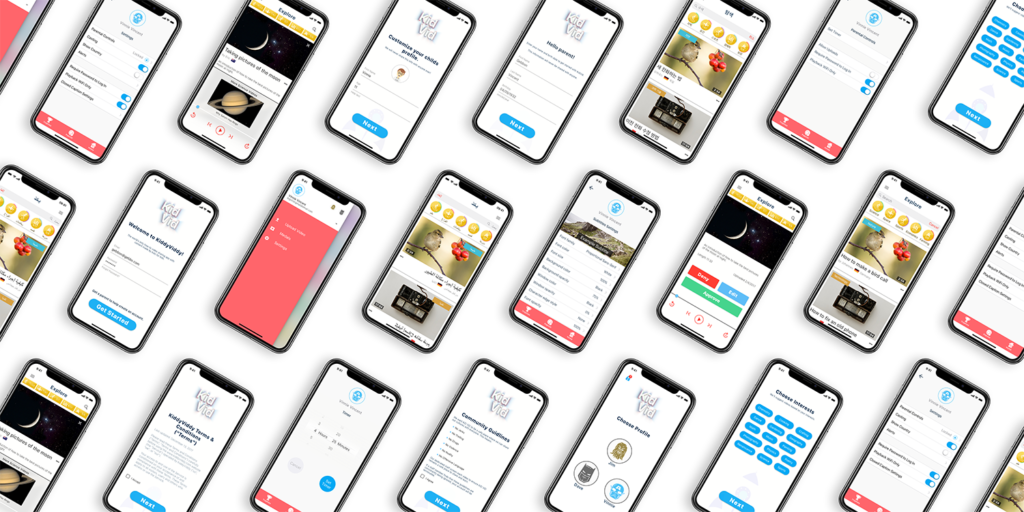
KidVid’s mission is to offer children around the world the opportunity to share their skills and talents; to feed their innate curiosity, and support their desire to learn about their peers around the globe.

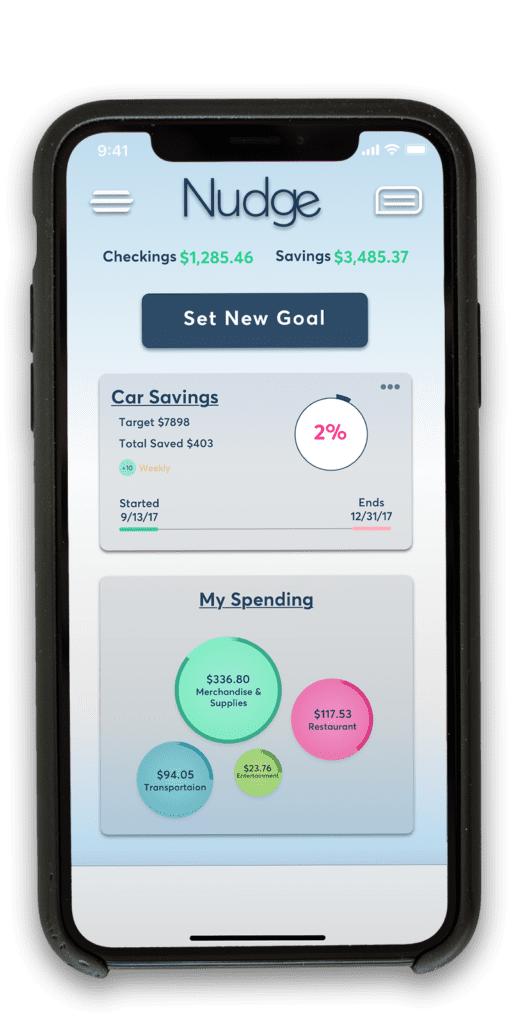
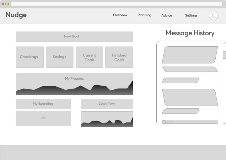
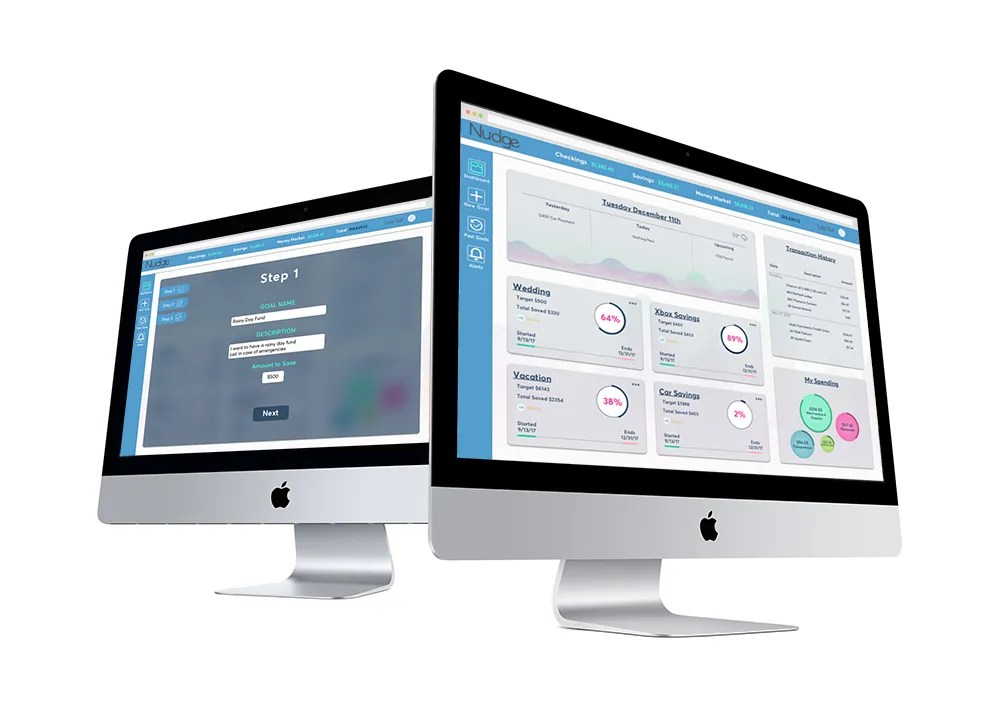
Nudge Financial brings a new approach to helping Americans manage their wallets.
Case Study

Case Study

Project Overview:

A client needed a tool for due diligence on companies based on ESG, SDG, IRIS, IRIS+, and TCFD best practices. The no-code tool they initially used couldn’t handle the complex logic required, so a custom application was developed.

Challenges and Solutions:

The no-code tool couldn’t manage multi-step filtering of information. The new application was designed with a three-layer structure (Firm, Fund, Due Diligence Pipeline) to handle complex filtering and logic requirements. This allowed for tailored due diligence processes specific to each fund’s investment focus.
Key Features:
  • Firm Level Configuration: Specific parameters like TCFD and CDB questions and responses will be entered at the firm level. These will be applied to any of the funds within the firm. 
  • Fund Level Configuration: Funds within firms select investment sectors, filtering relevant information and metrics.
  • Due Diligence Pipeline: Due diligence processes are tailored based on fund configurations, ensuring relevant data is used for evaluations.
User Experience:

An intuitive, step-by-step UI was designed using Figma, leading users through a natural path of progressive disclosure. A robust fund configuration module was developed for users to drill down on impact metrics and diligence framework items.

Outcomes:

The application significantly improved the client’s workflow by allowing firms to tailor funds to specific ESG targets and track companies against a comprehensive set of compliance data. It provided a unified platform for managing multiple sets of metrics in green investing.

Case Study

Case Study

Optimizing GetDone's Internal Tool for Scalability

Background:

In March 2021, I joined GetDone, a startup creating a marketplace for multifamily property managers to order services such as painting, cleaning, and repairs. My initial role was to improve the internal back-office tool, “Invictus,” which, despite its robust functionality, was cumbersome and inefficient for daily use.

Problem

Invictus was cluttered and lacked clear visibility into the problems our “Pros” (third-party vendors) were experiencing. Something as simple as a pro requesting a set of keys could get lost in the shuffle, causing delays across the whole system. 

Operations users could only manage around 10-15  jobs daily, hindering scalability.

Goal

My objective was to increase the efficiency of operations users, enabling them to manage over 100 jobs daily and automate routine tasks.

Initial Discovery

I spent about a week sitting with operations, going through all of the daily tasks and issues they would normally run into. I also installed FullStory to run analytics and see the most used paths. 

This research led to the discovery that:

  • There were multiple tables for each job status, causing fragmented information views.
  • Users had to manually navigate through numerous screens to track job progress.
  • There was no intuitive navigation, forcing users to restart workflows frequently.
    Working Sessions

I conducted workshops with the operations team that, amongst other findings, led to our preferred workflow:

  1. Login
  2. See Notification(s)
  3. View Dashboard
  4. Select issue
  5. Resolve the issue via a contextual drawer

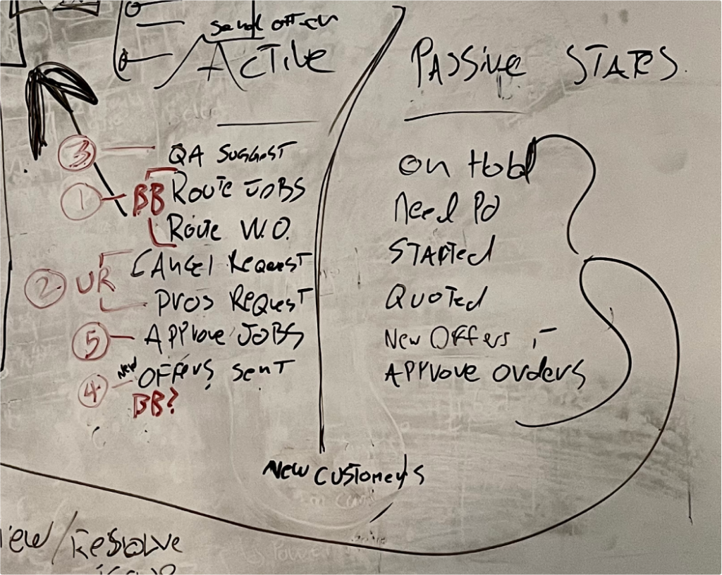
We identified job statuses requiring immediate action (“Active States”) and those that were less urgent (“Passive Statuses”).

Active States:

  • Quality Walk Suggested
  • Route Jobs
  • Route Work Order
  • Cancel Request
  • Pro Request
  • Approve Jobs
  • Offers Sent

Passive Statuses:

  • On Hold
  • Need PO
  • Job Started
  • Price Quoted
  • New Offers
  • Approve Orders

Solution Development

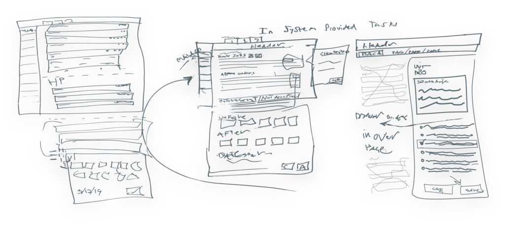
I sketched possible workflows and developed a low-fidelity prototype in Figma. We then designed contextual action drawers for each job status, collaborating closely with operations users to streamline processes.

For example, the drawer for routing jobs included a list of contractors and their rates, simplifying the assignment process.

Implementation and Impact

Once implemented, the new workflow significantly reduced the time spent by operations users in the tool by 80-90%. The intuitive design allowed us to outsource day-to-day management to an offshore team, saving costs and freeing the local team to focus on strategic tasks. This transformation enabled a single user to manage hundreds of jobs daily.

Continuous Improvement

Over the following year, we continually refined the Task Dashboard and used it to train and validate our machine-learning models.

Introducing the Task Dashboard workflows was the most impactful change, enhancing scalability and operational efficiency.

Case Study

Case Study

Going Mobile! Working with KDOT to streamline work orders.

Background:

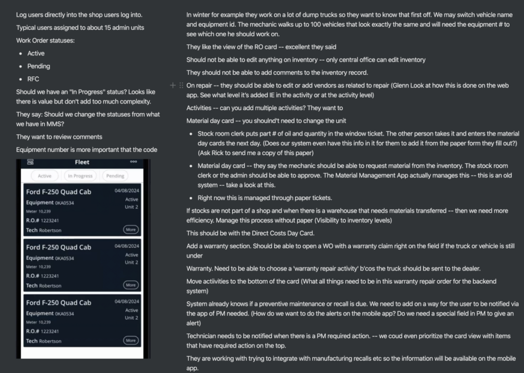
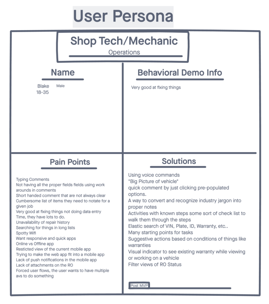
When Kentucky’s Department of Transportation (KDOT) needed a new way to manage work orders, I went beyond merely reorganizing the information architecture on the screen. I facilitated workshops with key stakeholders at KDOT to discover their need for a mobile solution where workers could input data and take pictures of the work done in one place.

Problem

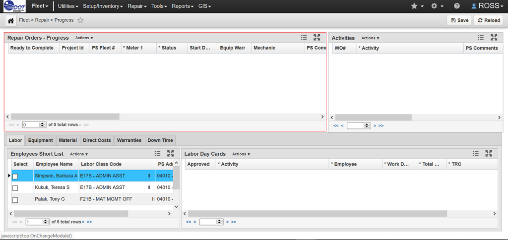
The existing system faced significant communication issues between the people inputting the work orders and those managing them. This miscommunication led to an over-bloated application that was difficult to use, primarily because it was not designed for its current use case.

Workshopping 

To address the issue of an over-bloated app, I organized a comprehensive workshop that brought multiple stakeholders from KDOT into the same room—a significant achievement given the complexities of coordinating within a government agency.

Workshop Takeaways

  1. Legacy App Issues: The existing app was filled with information 80% of users found useless.
  2. Lack of Client Consultation: The development process did not involve consulting the clients about their needs, leading to a product that met bureaucratic specifications rather than user requirements.
  3. Workflow Flexibility: The workflow needed to provide multiple avenues to accomplish a task, enhancing usability and efficiency.

Implementation

Following the initial workshop, I set up additional smaller workshops on a bi-weekly basis to present and refine workflows and wireframes. The primary goals of these workshops were to ensure that:

  • Efficient Workflows: The workflows were designed to be efficient for the end-users.
  • Correct Information Architecture: The screens’ information architecture was optimized for usability.

Conclusion

This project had multiple challenges, but the most significant failure point of the original application was the disconnect between management within KDOT’s structure. In product development, one of the most complex challenges can be articulating the problem you are trying to solve. By fostering better communication and involving all stakeholders in the development process, we created a more efficient and user-friendly solution.

Case Study

KidVid

KidVid Learning Platform

KidVid’s mission is to offer children around the world the opportunity to share their skills and talents; to feed their innate curiosity, and support their desire to learn about their peers around the globe. In doing so, we strive to enable them to become empathetic, culturally aware, digitally able and empowered citizens.

What is KidVid?

  • KidVid is a peer-to-peer video sharing service dedicated to youths sharing their skills and talents across the globe.
  • Kids can publish their own how-to video tutorials. These videos are then prescreened for safety, translated into multiple languages, and categorized into subjects.
  • KidVid users can learn new skills, languages, feel empowered and ultimately learn about each other.

Objectives:

  • To conduct user research to find out the concerns of parents.
  • Build a universal design that will accommodate multiple languages.
  • Design a product that addresses parents concerns, and kids natural curiosity.

Why KidVid?

When it comes to educational companies that provide learning content, the market is reaching the point of saturation. Among the Udemy, PluralSight, Skillshare, Udacity, and Coursera of the world, there is no shortage of online educational content.

However, if you search for videos geared towards youth, you will find a very slim market. Most of the companies providing content are attached to known schools and require some sort of enrollment. Also, they are designed by educators with specific objectives in mind.

I wanted a service that allowed the kids themselves to do the education. A place where kids were teaching each other and solving problems together.

Research:

I started my research looking for data about children’s safety online. A study conducted by ESET (a leader in threat detection software) Asked parents via surveys: “What specifically concerns you when your child accesses the internet on a smartphone or tablet?”

According to this survey, the most common concerns among parents are:

  • 81% worry about their children visiting inappropriate web pages;
  • 71% are concerned about their kids giving their personal details to strangers online;
  • 61% worried that their children spend too much with the device.


I interviewed parents in person and their responses to similar questions were in line with the ESET survey. Talking one-on-one with parents gave me a greater understanding of the issues of child safety online. Survey results were a great start, but getting out and seeing the faces of concerned parents made the issue more personal.

Design Process

I applied the following design process:

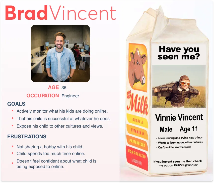
Who would use KidVid?

Here are some of my initial assumptions.

A child who:
• Loves learning and trying new things.
• Wants to learn about other cultures.
• Can’t wait to see the world.
• Is between 8 and 14 years old.

A parent who:
• Likes to be involved in their child’s activities.
• Is more technically savvy than most people.
• Wants to have more control over the content their child is viewing online.

Primary concerns:
“ Comments on their video posts (from other kids as well as predators posing at kids). And what my kids might be exposed to when watching content created by other kids”

Headaches and Obstacles:
“Having to screen EVERY video before they upload it, and knowing they will try and upload them without my knowledge”

With a persona designed I began the sketching process, I used 10x10s to explore concepts about how certain screens should look. I did this over and over taking into account the behaviors of my personas.

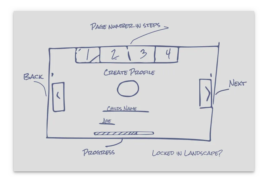
My original idea involved the orientation in a landscape similar to YouTube Kids. However, when I presented it to parents they disliked it. Trying to type information on a landscape keyboard was NOT the preferred method for adults. Building the information architecture in a landscape orientation was overly difficult compared to laying out a wireframe in portrait view. Ultimately I redesigned the wireframes to a portrait view by default with the option to turn the phone to landscape if the user wished to. This presented the most user-friendly option first.

Summary: Designing onboarding simplicity needs to be a priority.

Breaking rules:

My target demographic was kids between the ages of 10 & 14. Because of this, I could take advantage of how quickly youths pick up and learn new technologies. I wanted to break out of the traditional design norms and try some new things. If SnapChat can do it why can’t I?

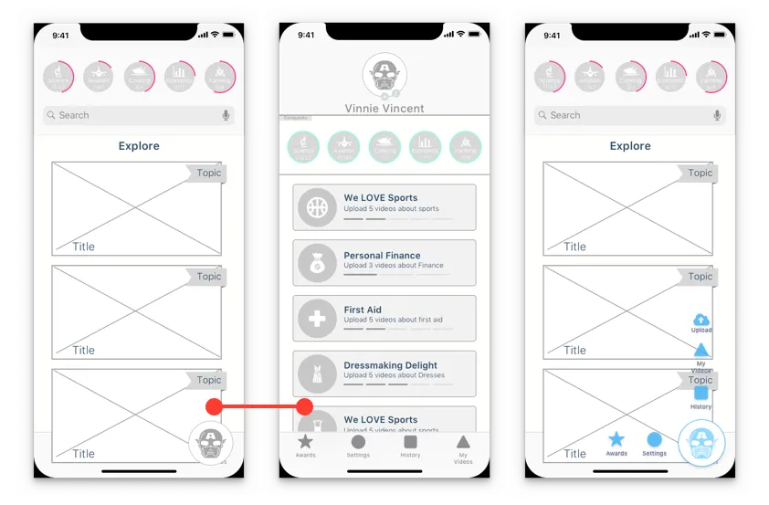
I designed the main dashboard to include a single FAB that when pressed would take users to a secondary page. When this didn’t test well I redesigned the FAB so that when pressed it opened up with both vertical and horizontal icons. In this design, I didn’t take into account the need for any additional submenus. After trying out those design ideas, and seeing users struggle to complete tasks. I made the decision to use material designs guidelines. Using a design guideline takes away most of the guesswork, and provides great rules to follow. Unless there is a specific design problem you’re trying to solve. Don’t try to reinvent the wheel, stick with patterns that people are already familiar with. Don’t waste time designing answers to problems that didn’t exist.

Gamification:

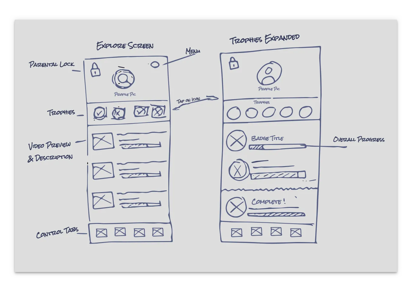
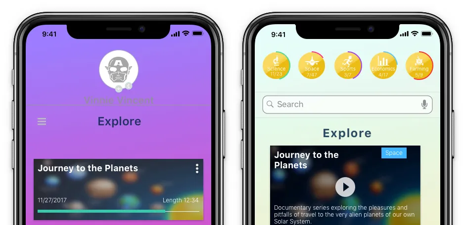
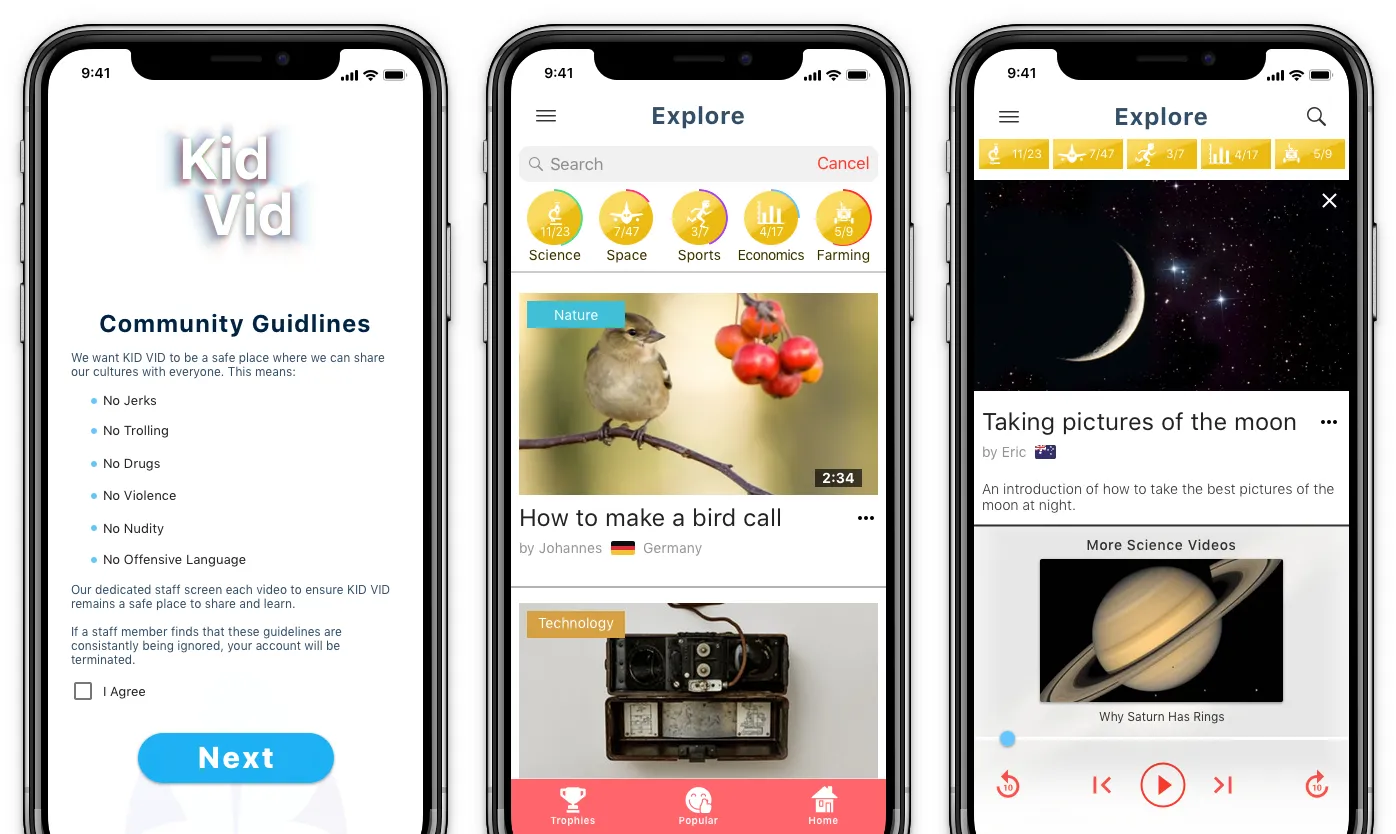
During user testing, I started thinking about how to keep users involved in KidVid long term? What will keep kids motivated and consistently coming back to the product? I considered implementing achievements for watching a certain amount of videos within a learning category. Rewarding kids for improving their knowledge. Similar to the way DevHub does when users learn to code using its services. Also, knowing that this app would be used worldwide, I wanted the achievements to have a visual look that is universally recognized across the globe. I went with Olympic style medals of Gold, Silver, and Bronze. They are recognizable across cultures.

User Interface

Color:

When laying out screens in wireframes it’s easy to just focus on the content and placement of things. As I started moving from wireframes into higher resolution the issue of how my color scheme would work across cultures came up. I originally wanted to use very bright and bold shades in my product. After talking with my colleagues about color options I realized I hadn’t taken into account how things are perceived around the world.

However, after doing some more research I learned that not all colors are created equal across the world. For example, green in the United States is related to money and growth. In Spain, it is related to being racy, sexy, and cheap. I tested several color layouts and with each iteration, the color choices became universal in terms of how they would translate across cultures. The last thing I wanted was an app with colors that are in total conflict with the culture of the user.

Multiple Languages:

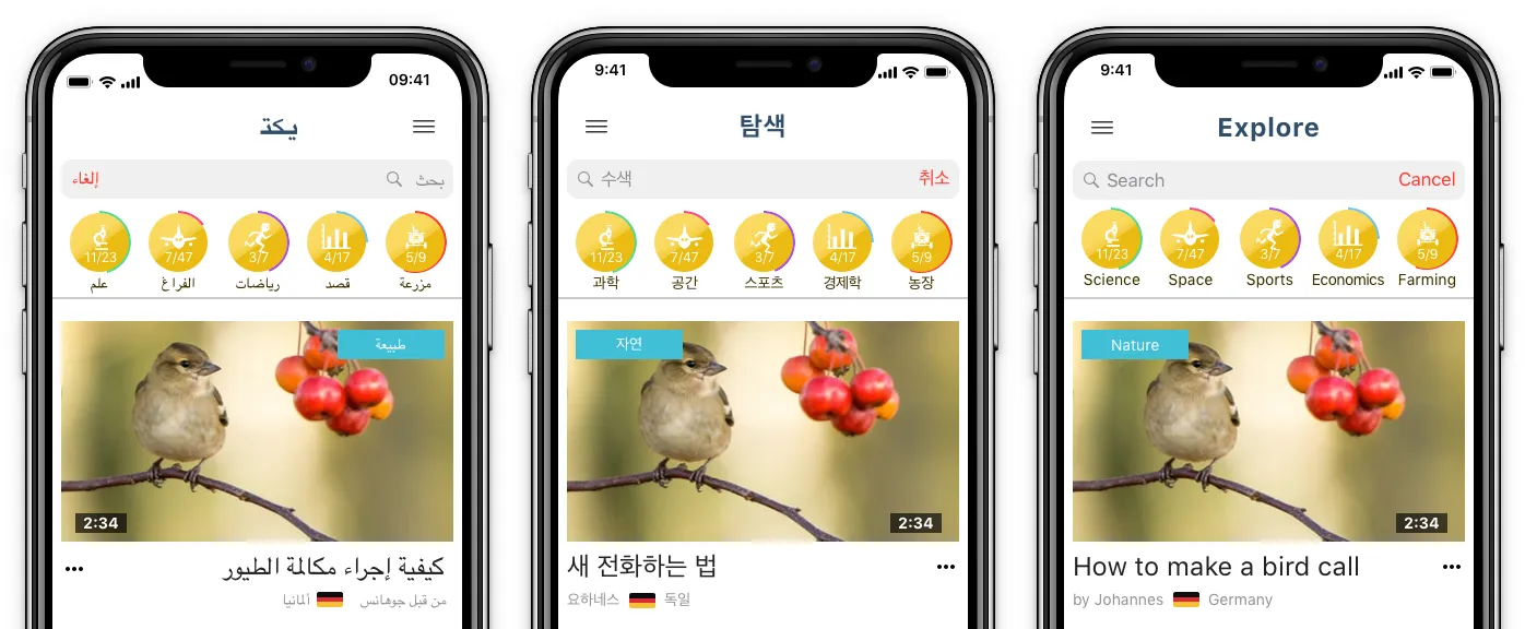
I needed to account for the various languages spoken throughout the world. In the West, we read right to left. In the Middle East, they read left to right. In Asia, they use symbols in writing. I used Google translate and worked on 3 wireframes simultaneously testing layouts that would accommodate text in English, Korean, and Arabic.

I created layouts that maintain the same visual look regardless of the text placed in them. Giving letters adequate padding within their placeholders. Designing pages that mirror easily when flipped for reading right to left. I wanted KidVid to have the same look and feel wherever you were in the world. It was important to have that consistency within the product.

Trust, Safety, and Security:

I wanted to begin earning parents trust starting with the onboarding process. To do this I gave a clear explanation of why I needed each piece of information and how it would be used within the product at every step.

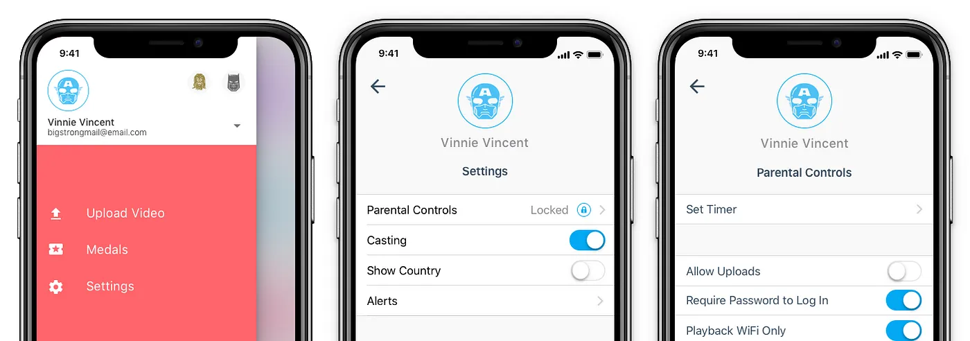
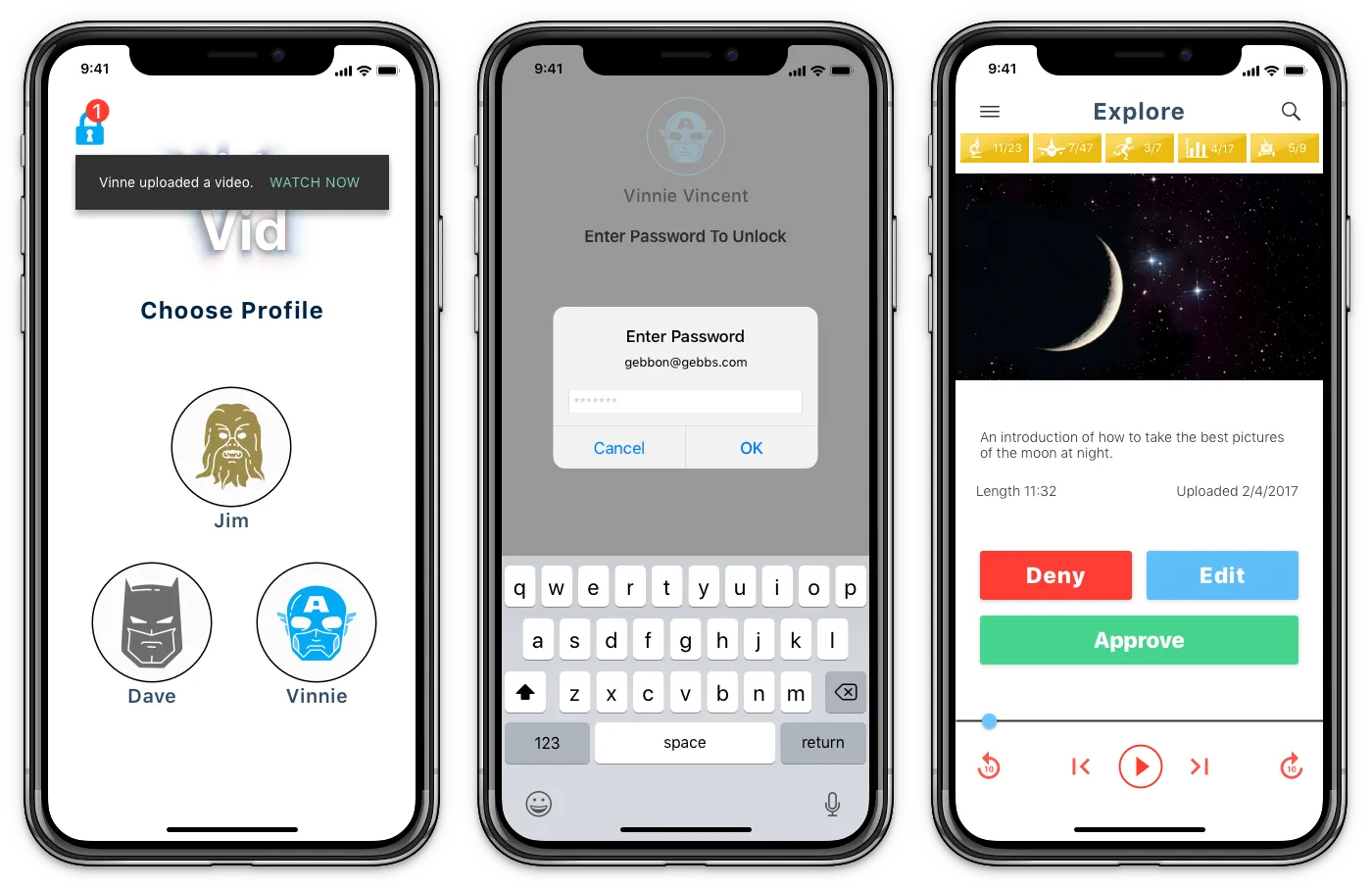
I want to give parents as much control over things like what videos kids can watch. Or stop them from uploading anything if their parents want to screen it first. I felt that I needed to make a parental admin panel where they could look at everything. The easy design solution would be to make a web portal where I would have more space than on a mobile app. When I presented this idea to a small group of parents they weren’t keen on it. They wanted to keep everything in the mobile app. To solve this I designed into the settings a parents control panel that was behind a lock-wall to keep kids from having access to things their parents didn’t want them to have.

These were items like a daily timer and the option to allow a child to publish their video. If this setting was turned to off a child could upload a video, but it would not be published until a parent viewed it and approved it. Parents would also have to acknowledge that the video met the community guidelines.

Prototyping:

I designed the prototype to showcase some of the security settings by taking the user through a certain scenario.

Scenario 1:
A parent receives notification that child has recently uploaded a video and is awaiting approval.
What does this notification look like?
What information does it contain?
How does this journey look? Step 1 step 2 etc..

Takeaways

As a designer, it’s easy to assume I know what is best for the product. This was evident in my original color scheme, layout, and my attempts to use buttons for new purposes. However, after failed user tests and many discussions with more experienced colleagues, I began researching things like the meaning of colors and how to present text in different cultures. I learned that taking the idea of an all kids video sharing service and building it into a functional prototype was a much more complex project than I had originally assumed. It took endless hours of research and dozens of user tests and design changes.

If you’re wondering “was it worth it?” My answer is absolutely!

With each iteration, I learned something new that I can apply to projects later in my career. I gained detailed knowledge of how to work across cultures and languages through trial and error. In the end, it’s important to know that I am not designing for a small group of users but for a worldwide base of users who are all trying to reach the same goal by using the product.

The End

Case Study

Case Study

Nudge Financial Case Study

Project Overview

Based on financial research, 63% of Americans are financially illiterate, they lack the basic skills to reconcile their bank accounts, pay their bills on time, pay off debt and plan for the future. Another survey found that 62% of Americans have $1,000 or less saved up; one out of five has nothing saved at all.

Goal

Design a financial application that promotes short and long-term goal setting.

Problem

To address financial illiteracy and help users reach their financial goals, it was crucial to understand the root causes. We sought to uncover why people struggled with their financial goals through in-depth user research.

Research

Our research began with online surveys distributed over a two-week period to approximately 100 participants, yielding a 20% response rate. Respondents, aged 18–35, were sourced through a third-party polling service. We conducted direct interviews with survey respondents to gain deeper insights into their spending and saving habits. Key questions included:

  • What challenges do you encounter when trying to save money?
  • What discourages you from saving money?
  • What motivations/incentives have helped you save money?

The interviews revealed that individuals often lacked structured plans for their financial goals, which informed the direction of our design process.

During interviews, when I asked people what their process was in achieving a goal I realized that people weren’t creating a plan. They would state something that needed to happen, like saving for a new car before they can buy one. Only doing that does not make it a goal, if it’s a goal then it has to have a plan of action. Something to follow with small achievements along the way to keep you motivated and on track.

Project Goals

Design an app that helps users make and reach financial goals, build financial understanding, and educate on saving. Key tasks included:

  • Starting a budget
  • Reducing spending
  • Setting monthly savings goals

Persona

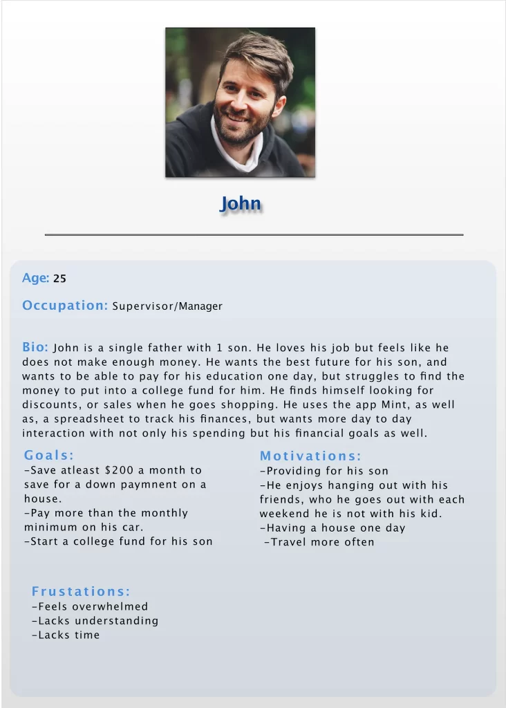
Our primary persona, “John,” was a single male aged 18-35, struggling with financial management. This persona informed our design decisions, ensuring we addressed relevant pain points.

The demographic having the most trouble with finances was:

  • Male
  • Single
  • Ages 18–35


This wasn’t the only demographic experiencing financial problems, but I chose to focus on this group for my persona. By combining these attributes with behaviors from user interviews, I developed my persona “John.” This tool was tremendously useful during the design process, allowing me to ask myself, “What would John do in this situation?” before designing wireframes for items like the side taskbar and goal cards.

Designing

When I designed the main dashboard of the application, I placed labeled elements on an artboard in Sketch. I would then have users review the artboard and indicate where they expected to find specific elements and explain why. I used this approach to guide my design while wireframing.

It was quick and easy to move elements around on the screen and get feedback. I believed users would better understand their financial situation with an organized dashboard.

I also built low-fidelity wireframes of the goal-setting process. When I presented the mockups for testing, I received feedback from several testers. The main concern was that the screens were too busy, and there were too many separate tasks in the process.

I redesigned them with the intent of reducing the number of tasks and the amount of screens. My takeaway from this was that people do not want to spend time on unnecessary tasks. However, they weren’t put off by extra tasks as long as they understood the reasoning behind them.

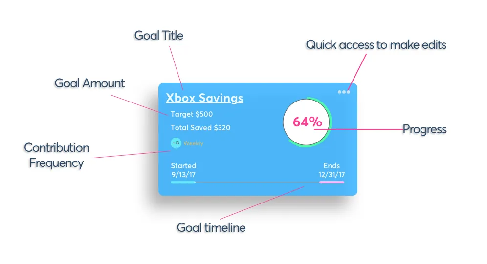
When I designed the goal cards for the dashboard I wanted to achieve two things. First, they needed to be easy to read. Second, I wanted them to reflect the principles of the goal process. In testing, I would ask “How close are you to accomplishing this goal” or “How much have you currently saved towards this goal”. My expectation was that the information was located where people expected it to be. My first few designs were off the mark. Testers couldn’t tell what the various percentages and graphs meant. After a few rounds of less than stellar feedback, I decided I needed to go back and redesign them.

I revisited the questions asked during the goal creation process and requested users to rank which tasks were most important for tracking daily progress. Using their feedback, I built the information architecture based on the most critical elements identified by the users. After several more rounds of feedback and adjustments, I could successfully address the original questions with the testers. When users could accurately locate the relevant information, I felt I had achieved my original two goals.

Once I had completed testing the product in low-fidelity and reached a point of confidence, I transformed my designs into high-fidelity prototypes to present to stakeholders.

Final Thoughts

Over the course of designing this application, a couple of insights stood out. First, when it comes to finances and savings goals, people are eager to have the money saved but less enthusiastic about the process of saving. Second, if users take the time to set up a structured plan, they are much more likely to succeed.

My initial assumptions were that people were lazy and unmotivated about savings. I couldn’t have been more wrong. It was not the goal that was the problem but the process of reaching it. Once I made this paradigm shift in my assumption, designing became much easier. I could focus on how my designs were going to solve specific problems, and it made the entire process come into focus. I knew what I wanted the desired outcome to be, researched the best way to achieve that outcome, and then integrated it into my user flow.

The next step for this application is solving the development challenges of integrating with banks and credit unions across the country. Additionally, a live beta testing group is needed to research the real-world application of the process. This will help determine if using the app in an A/B setting helps people save and, if so, how much on average. Achieving this will ensure that Nudge could have a significant impact on personal finances.

A slightly longer version of this case study can be found on Medium.com